AECAN
Brand identity and campaign for the Canadian Students Association at Tec de Monterrey.

Roles
- Brand identity
- Logo design
- Campaign design
- Social system
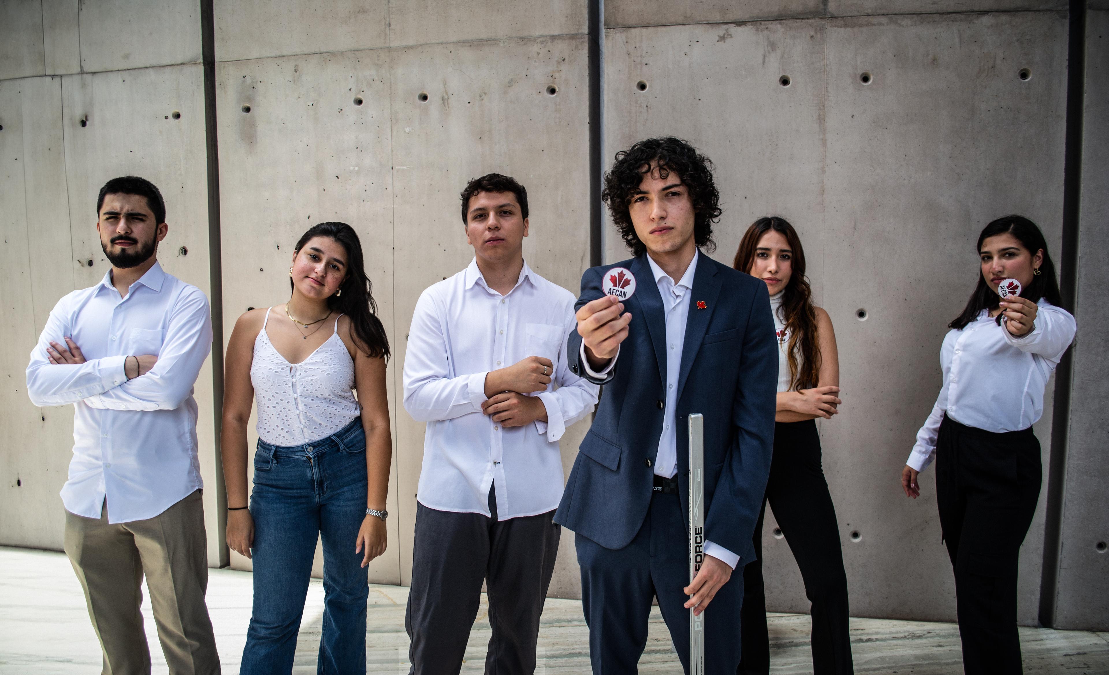
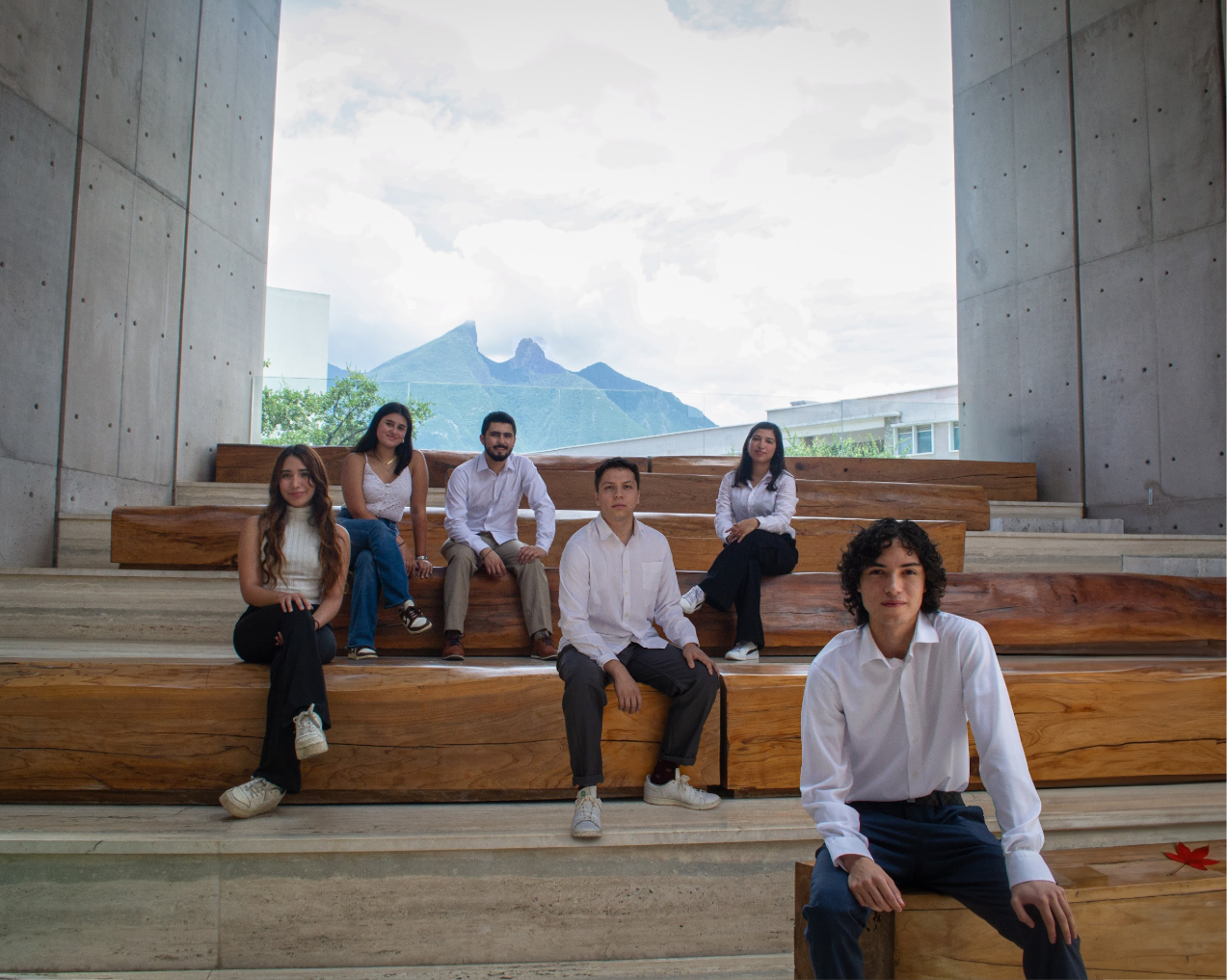
AECAN is the Canadian Student Association at Tec de Monterrey. As founder and first president, the work I most enjoyed was the brand — I ran the art direction, photography direction, graphic design, and tone end to end. The brief I set for myself: an identity that could carry a whole country’s worth of clichés without flinching, loud enough to win attention and warm enough to feel like an invitation.
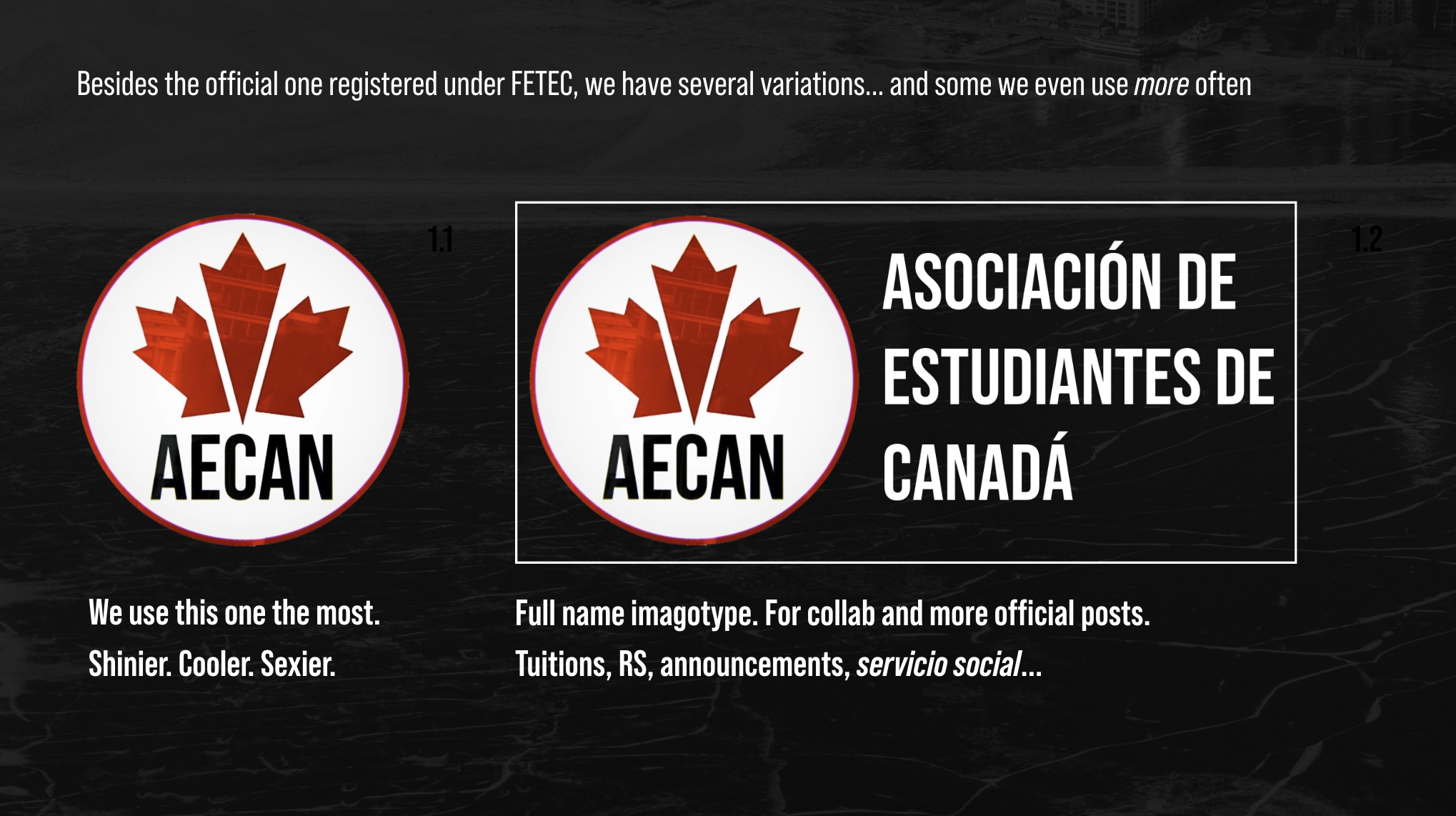
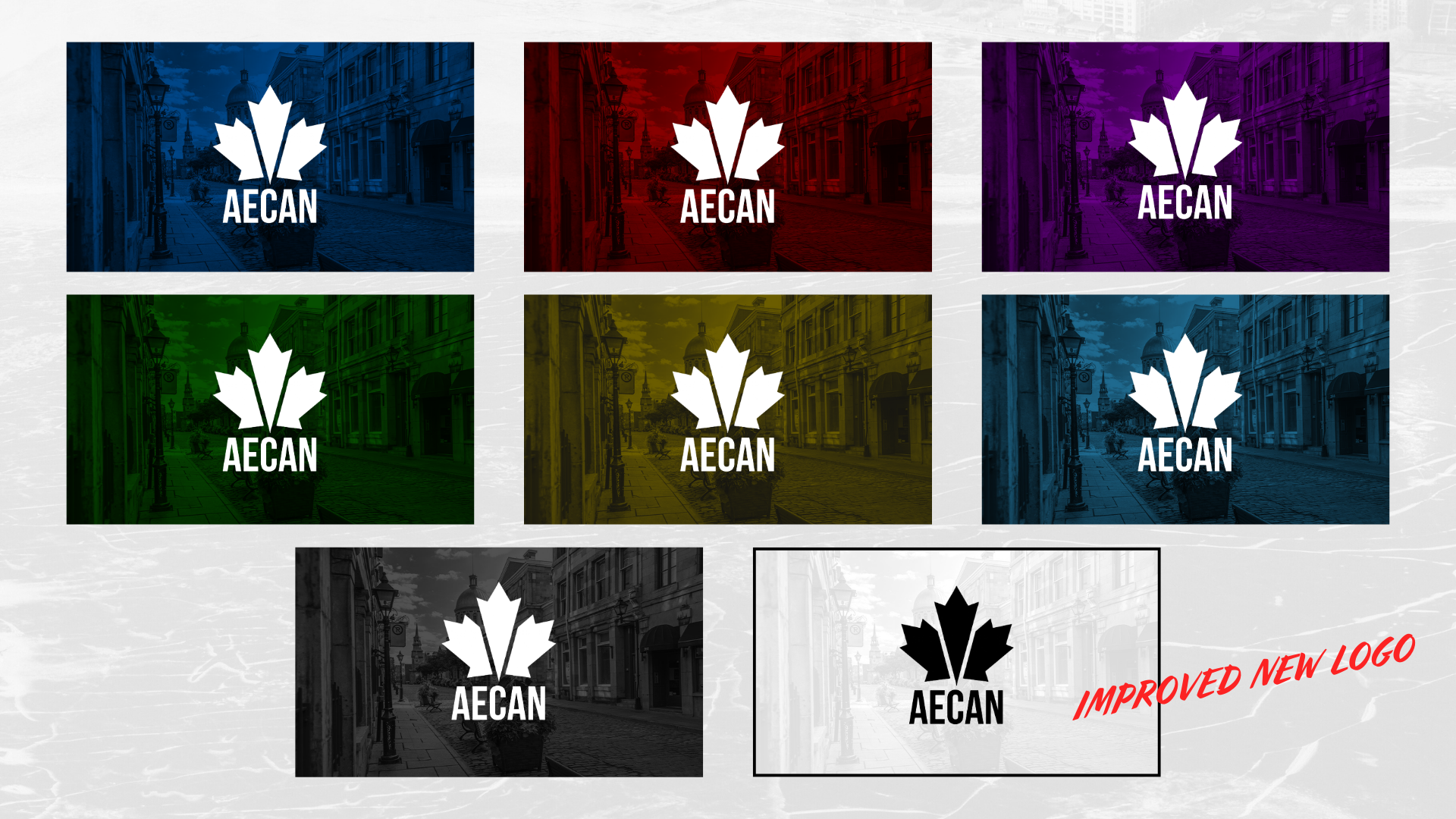
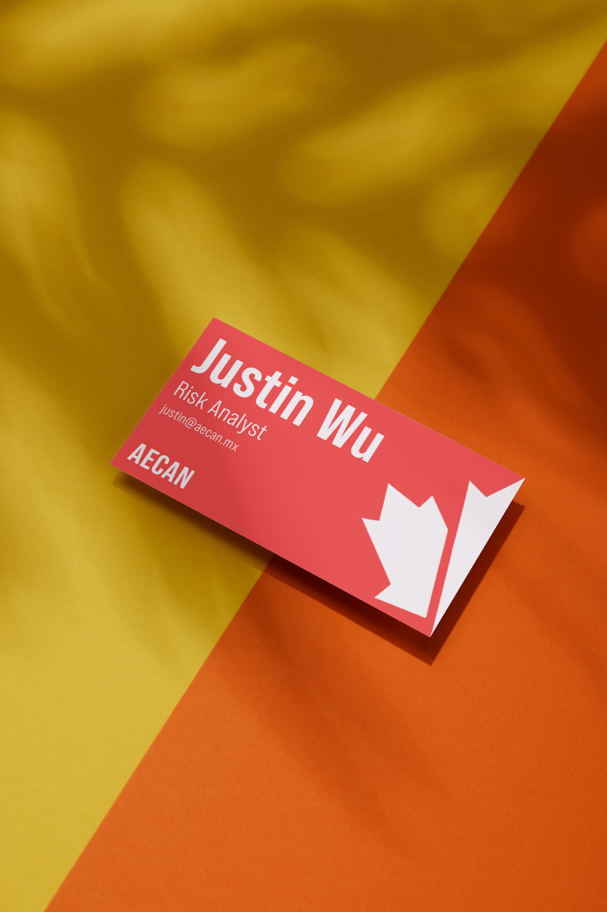
The mark is a maple leaf split into three clean blades, with AECAN set underneath: a badge that works as a stamp, a sticker, a pin with a full imagotype spelling out Asociación de Estudiantes de Canadá when the moment turned official. The leaf flexed across a row of colorways laid over street photography, and the stationery traded Canada’s flat red for a warmer autumn gradient, yellow melting into orange, the maple turning with the season.
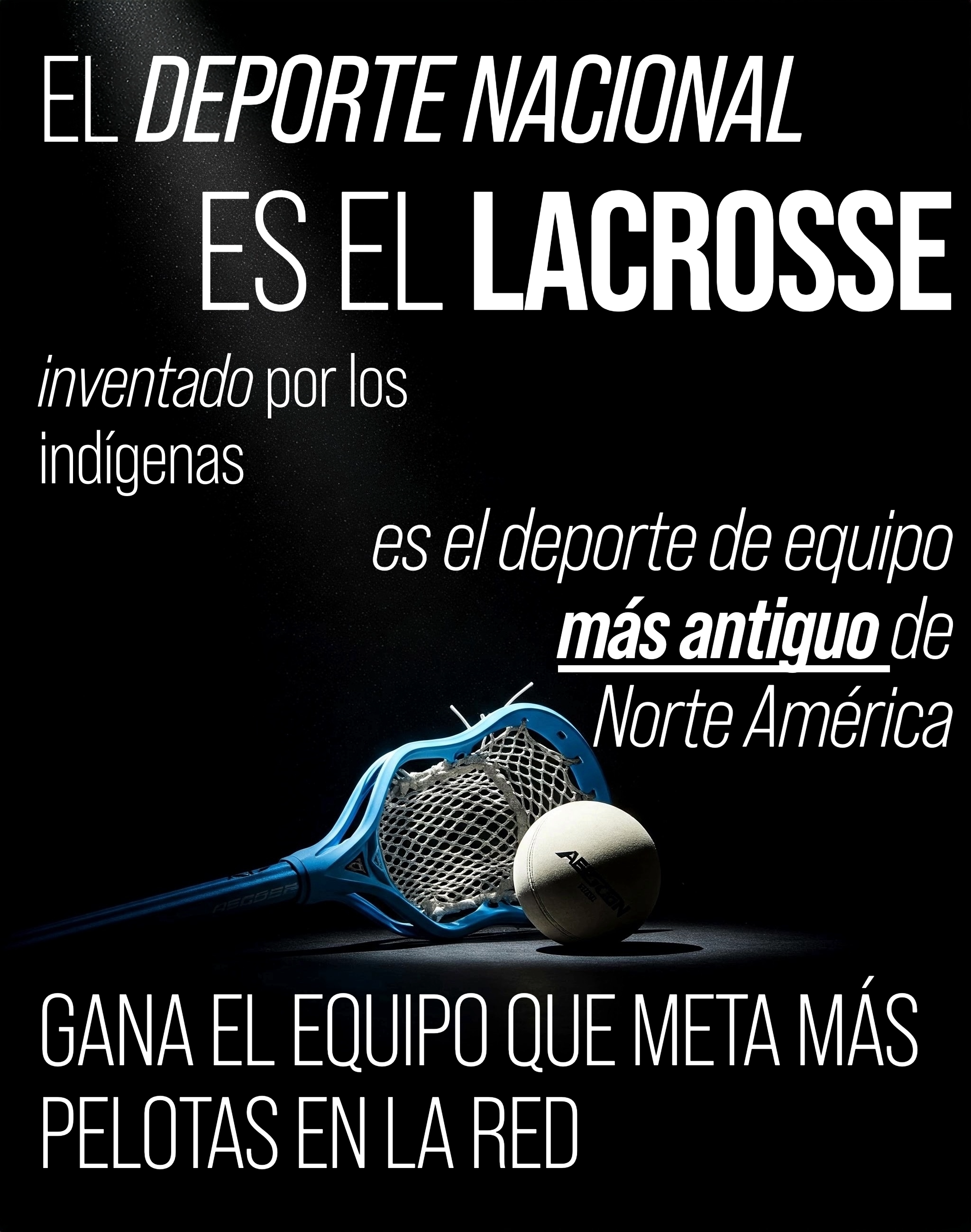
Its ultimate purpose: to be the bridge between Monterrey’s Tec community and Canada — a role that grew until AECAN became the campus chapter of the Canadian Chamber of Commerce. The system stretched from the logo and business cards to events, giveaways, and an Instagram engine, all of it pointed at that. In our first semester, AECAN won the award for digital strategy.